The standard deviation of the portfolio is \(\sqrt{486.1}= 22\%\), which is lower than 26.6% and 27.9%.
11.2 Volatility of a 2-stock portfolio
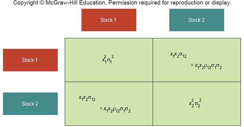
Covariance and Correlation
Let’s remember the basics about correlation.
11.2 Volatility of a 2-stock portfolio
Covariance and Correlation
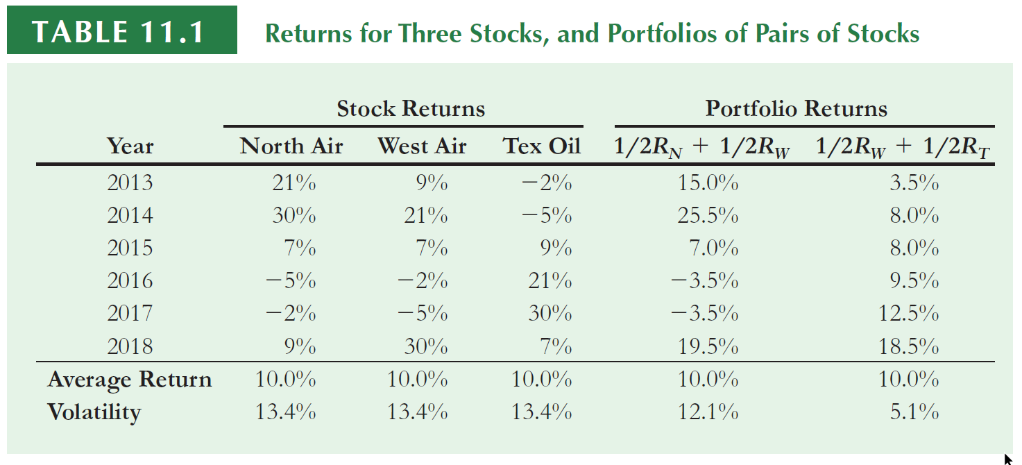
These assets have the same historical return and volatility, but they ‘move’ very differently:
For example, when North Air performed well, Text Oil tended to do poorly, and when North Air did poorly, Text oil tended to do well
North Air is not positively correlated with Text Oil.
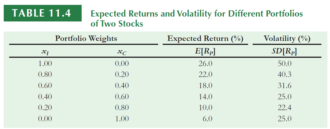
Consider the portfolio which consists of equal investments in West Air and Tex Oil. The average return of the portfolio is equal to the average return of the two stocks…
…However, the volatility of 5.1% is much less than the volatility of the two individual stocks.
The amount of risk that is eliminated in a portfolio depends on the degree to which the stocks face common risks and their prices move together.
Let’s compute the average return of a portfolio with 40% invested in A and 60% in B. The portfolio return is the average return of the assets.
R
# Defining weights and calculating portfolio return (daily)w <-c(0.40, 0.60)# Creating a df with stocks and weightsw_tbl <-tibble(ticker = stocks,w = w)# Including the weights in the df prices (which contains the prices)prices <-left_join(data ,w_tbl, by ='ticker')# calculating the product of return times the portfolio weights for all days (this is necessary to calculate average return)prices$w_ret <- prices$ret_closing_prices * prices$w# Creating a dataframe with portfolio returns port_ret <- prices %>%group_by(ref_date) %>%summarise(port_ret =sum(w_ret))# Creating prices from the vector of returnsport_ret$price_close2 <-cumprod(1+port_ret$port_ret) *100# Graph with all returnsport_ret$ticker <-'Portfolio'p <-ggplot(stock1, aes(ref_date , price_close2, color = ticker))+geom_line() +geom_line(data=stock2) +geom_line(data=port_ret) +labs(x ="",y='Closing prices', title="Two assets and Portfolio returns, Initial price = 100", subtitle ="Begin 01/01/2010") +theme_solarized()ggplotly(p)
11.2 Volatility of a 2-stock portfolio
Covariance and Correlation
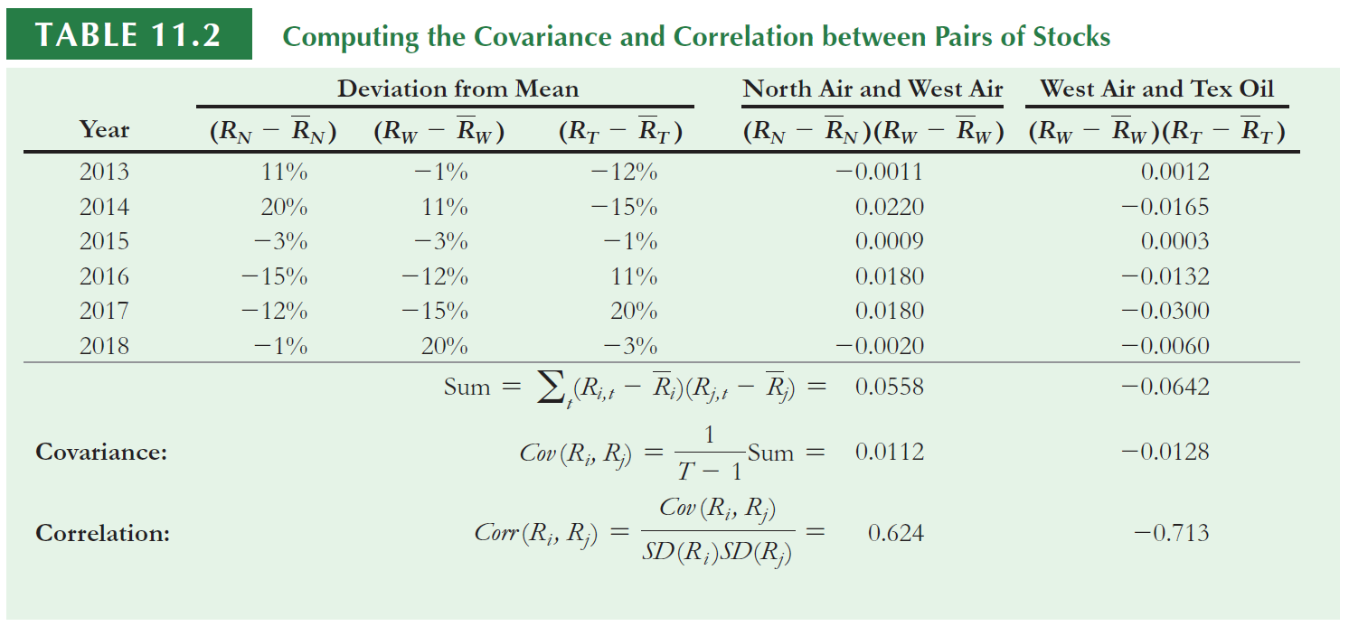
If you don’t remember how to calculate manually the correlation, please take a look at the notes of your statistics lectures.
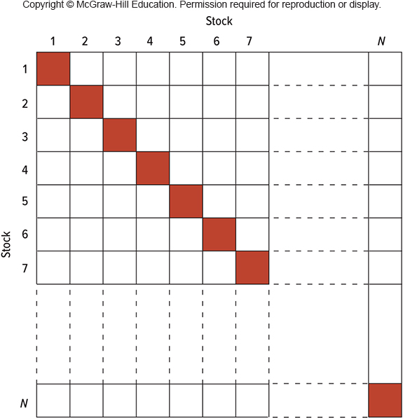
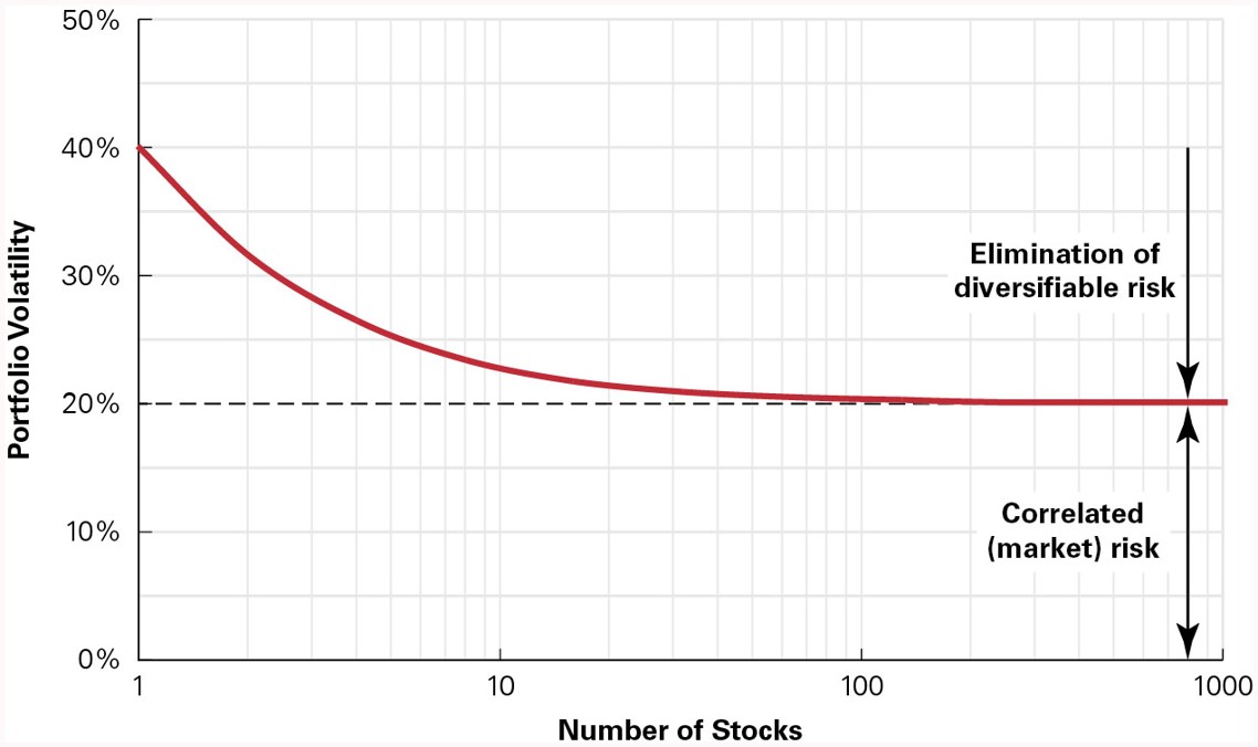
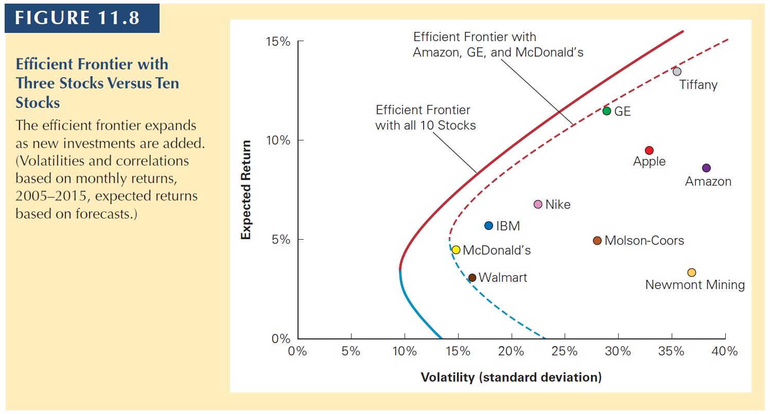
11.3 Volatility of a large portfolio
11.3 Volatility of a large portfolio
11.3 Volatility of a large portfolio
The variance of a three-asset portfolio can be built using a previous slide…
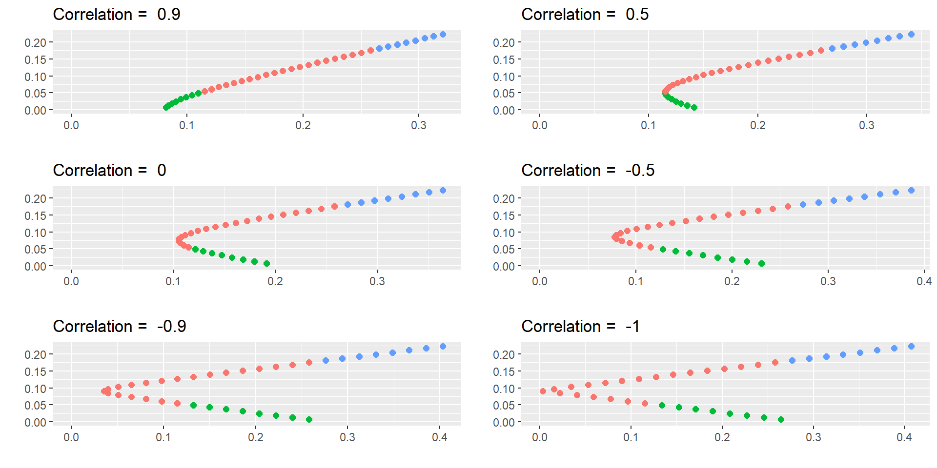
library(ggpubr)library(dplyr)# Create a vector of correlation values to loop throughcorrs <-c(0.9, 0.5, 0, -0.5, -0.9, -1)# Initialize an empty list to store plotsplot_list <-list()# Loop through each correlation value and create a plotfor (corr12 in corrs) { ret1 <-0.175 sd1 <-0.258 var1 <- sd1^2 ret2 <-0.055 sd2 <-0.115 var2 <- sd2^2 covar12 <- corr12*sd1*sd2 w1 <-seq(from=-0.4, to=1.4, by=0.05) w2 <-1- w1 retp <- w1*ret1 + w2*ret2 varp <- w1^2* var1 + w2^2* var2 +2*w1*w2*covar12 sdp <-sqrt(varp) port.names <-paste("portfolio", 1:length(w1), sep=" ") df <-data.frame(port.names, w1, w2, retp, sdp) df <- df %>%mutate(Condition =case_when(w1<0~"W1<0" , w1>1~"W1>1" , 0<w1 | w1<1~"0<w1<1" )) d1 <- df[df$w1 ==1, ] d2 <- df[df$w2 ==1, ] plot <-ggplot(df, aes(sdp, retp, color= Condition) ) +geom_point(size=2) +labs(x ="",y="")+xlim(0, max(sdp)) +ylim(0, max(retp)) +theme(legend.position ="none") +theme()+ggtitle(paste("Correlation = " , corr12)) plot_list[[length(plot_list) +1]] <- plot}# Arrange the plots in a 3x2 grid using ggarrangeggarrange(plot_list[[1]], plot_list[[2]], plot_list[[3]], plot_list[[4]], plot_list[[5]], plot_list[[6]],nrow =3, ncol =2)
11.3 Volatility of a large portfolio
More about correlation
In these graphs, I am assuming that you can invest a negative amount in a stock. This is called a short position. When you buy, you have a long position.
Short sales are usually allowed if you provide enough security and collateral to the market.
The idea is that you think that a stock’s price will go down so you sell it. Later, you buy it back (but if the price goes up, you lose part of your investment).
Notice that if you can short sale, you amplify the pairs return-risk available.
Error in dplyr::rename(., ticker = Ticker, company = Company, industry = Industry) :
Can't rename columns that don't exist.
✖ Column `Ticker` doesn't exist.
R
stocks <-unique(df$ticker)df <- df %>%select(ref_date)for (i in1:length(stocks)) {data <-yf_get(tickers = stocks[[i]], first_date = start,last_date = end,freq_data = freq_data)data<-data[complete.cases(data),] data<- data %>%select(ref_date, ret_closing_prices)colnames(data) <-c("ref_date", stocks[[i]] )df <-merge(df,data,by="ref_date")}dup <-duplicated(df)df <-unique(df[!dup,])df$ref_date <-NULLret <-as.vector(colMeans(df))cov <-cov(df)# Random numbers to create the frontierset.seed(100)int <-10000w<-data.frame((replicate(length(stocks),sample(int,rep=TRUE)) / int ))w$sum <-rowSums(w)colnames(w) <-c(stocks, 'Sum')for (i in1:int) {w[i, 1:length(stocks)] <- w[i, 1:length(stocks)] / w[i, ncol(w)]}w$Sum <-NULL# creating final dataframeport <-data.frame(matrix(NA,nrow = int,ncol =2))colnames(port) <-c("Return", "Sd")for (i in1:int) {port[i,1] <-sum( w[i, ] * ret)port[i,2] <-sqrt( as.matrix(w[i, ]) %*%as.matrix(cov) %*%as.matrix(t(w[i, ]) )) }#ggplotp<-ggplot(port, aes(x=Sd, y=Return)) +geom_point(alpha=0.2) +theme_solarized() +xlab("Standard deviation") +ylab("Expected Return") +labs(title =paste(int , "random portfolios - All Ibov (2010-2023, yearly returns)") )ggplotly(p)
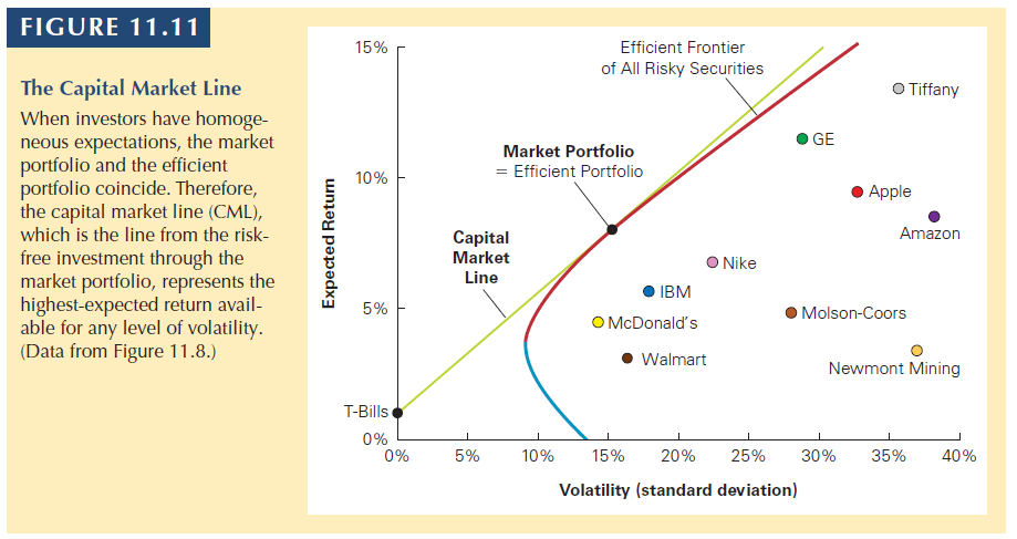
11.5 Risk-Free Saving and Borrowing
11.5 Risk-Free Saving and Borrowing
Thus far, we have considered the risk and return possibilities that result from combining risky investments into portfolios.
By including all risky investments in the construction of the efficient frontier, we achieve the maximum diversification possible with risky assets.
Now, let’s see what happens when you combine a portfolio of risky assets with the risk free asset.
11.5 Risk-Free Saving and Borrowing
The return is:
\[E[R_{px}] = x \times E[R_p] + (1-x) \times R_f \]
\(x\) is the weight invested in the portfolio:
Which leads to:
\[E[R_{px}] = x \times E[R_p] + R_f - x \times R_f \]
\[E[R_{px}] = R_f + x \times ( E[R_p] - R_f ) \]
The second equation shows that: The expected return is equal to the risk-free rate plus a fraction of the portfolio’s risk premium, \(E[R_p] - R_f\), based on the fraction x that we invest in it.
11.5 Risk-Free Saving and Borrowing
Remember that the risk free rate is assumed to have no risk, thus no variance. The standard deviation is:
If you borrow at the Rf to invest in a portfolio, you have a levered position.
You are investing more than 100% of your funds in the portolio. The weight is higher than 1.
The book calls this buying stocks on margin.
11.5 Risk-Free Saving and Borrowing
To identify the tangent portfolio, we compute the Sharpe ratio.
\[Sharpe\;ratio = \frac{E[R_p]-R_f}{Sd(R_p)}\]
To earn the highest possible expected return for any level of volatility we must find the portfolio that generates the steepest (highest inclination) possible line when combined with the risk-free investment.
The optimal portfolio to combine with the risk-free asset will be the one with the highest Sharpe ratio, where the line with the risk-free investment just touches, and so is tangent to, the efficient frontier of risky investments
The Sharpe ratio measures the ratio of reward-to-volatility provided by a portfolio.
11.5 Risk-Free Saving and Borrowing
Fact 1: The tangent portfolio is efficient.
Fact 2: Once we include the risk-free investment, all efficient portfolios are combinations of the risk-free investment and the tangent portfolio.
All investors should have the tangent portfolio. All investors should combine the tangent portfolio with the risk free asset to adjust the level of risk.
If you ignore the risk free asset, you have several efficient portfolios (efficient frontier). But once you combine with the risk free rate, there is only one.
Let’s now consider how much return we will demand from a risky asset in order to make its inclusion in our portfolio worthy.
Let’s say that you hold an arbitrary portfolio P (it does not matter what is inside P for the moment).
You only include an additional asset if it excess return to the level of risk, right? That is, if it increases the Sharpe ratio of the resulting portfolio (Portfolio P + New asset)
What is the excess return that this asset i brings to your portfolio P?
\(E[R_i] - R_f\) (quite simple!)
What is the risk that this asset i brings to your portfolio P?
It is \(Sd(R_i) \times corr(R_i,R_p)\)
11.6 Efficient Port. and Required Returns
So now our question is: Is the gain in return from investing in i adequate to make up for the increase in risk?
To see that, we have to test if (because the right-hand part is the level of return-to-risk we already have in P).
That is, increasing the amount invested in i will increase the Sharpe ratio of portfolio P if its expected return \(E[R_i]\) exceeds its required return given portfolio P, defined as
\[R_i = R_f + \beta_i^P \times (E[R_p] - R_f)\]
11.6 Efficient Port. and Required Returns
The required return is the expected return that is necessary to compensate for the risk investment i will contribute to the portfolio.
The required return for an investment i is equal to the risk-free interest rate plus the risk premium of the current portfolio, P, scaled by i’s sensitivity to P, which is \(\beta_i^P\).
If i’s expected return exceeds this required return, then adding more of it will improve the performance of the portfolio.
11.6 Efficient Port. and Required Returns
To emphasize
This equation establishes the relation between an investment’s risk and its expected return.
It states that we can determine the appropriate risk premium for an investment from its beta with the efficient portfolio.
\[R_i = R_f + \beta_i^P \times (E[R_p] - R_f)\]
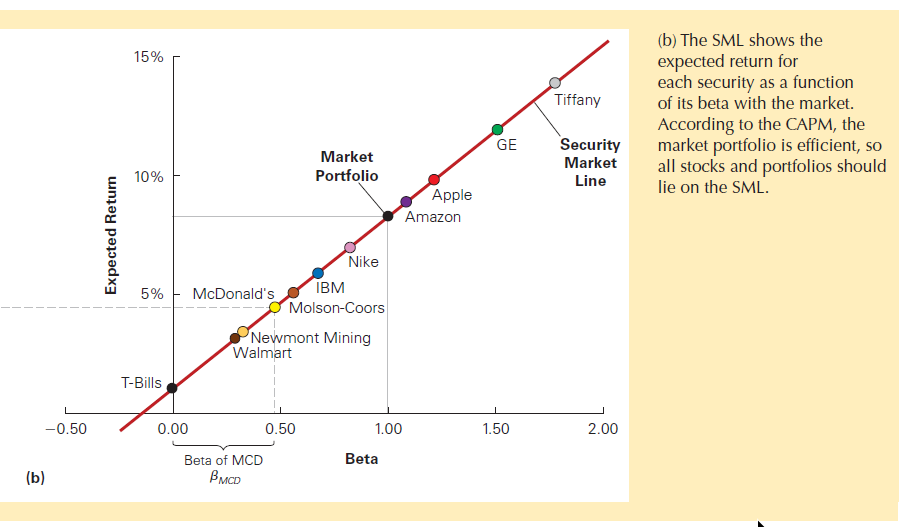
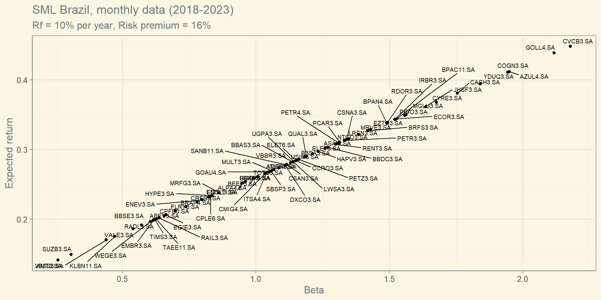
11.7 The CAPM
11.7 The CAPM
This is perhaps the most important model in Finance.
Three main assumptions:
Investors can buy and sell all securities at competitive market prices (without incurring taxes or transactions costs) and can borrow and lend at the risk-free interest rate.
Investors hold only efficient portfolios of traded securities.
Investors have homogeneous expectations regarding the volatilities, correlations, and expected returns of securities. There is no information asymmetry.
If investors have homogeneous expectations, they will identify the same efficient portfolio (the highest Sharpe).
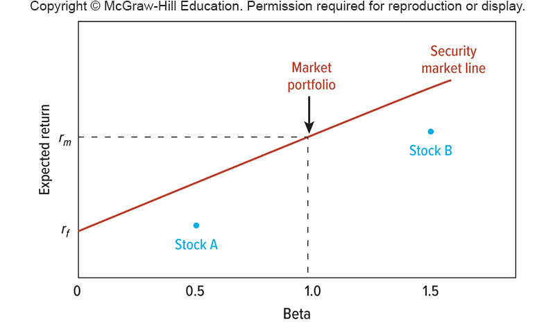
Under the CAPM assumptions, we can identify the efficient portfolio: It is equal to the market portfolio.
A Market portfolio contains all traded securities in a economy.
11.7 The CAPM
If investors identify the same market portfolio (the highest Sharpe), then we can identify the Capital Market Line (CML).
All investors will have a combination of the Market Portfolio and the Rf rate.
Under the CAPM assumptions, we can identify the efficient portfolio: It is equal to the market portfolio.
Thus, we can change \(R_p\) to \(R_m\)
\[E[R_i] = R_f + \beta_i \times (E[R_m] - R_f)\]
The beta of a security measures its volatility due to market risk relative to the market as a whole, and thus captures the security’s sensitivity to market risk.